
US: The Scariest Job Chart Ever
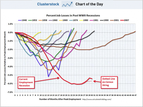
The chart, put together by Calculated Risk, and dubbed by BusinessInsider as “The Scariest Job Chart Ever” continues to be, well, scary. It shows that in the United States there is no v-shaped ascent as with other jobs recoveries. The dotted line excludes hirings for the US Census and is the accurate one because the headine rate will dip down to join it in a few months when the Census ends.
The US economy is pretty much screwed, and there’s no sign of any UK-style attempts to do anything about it. Roll on their November mid-term elections for a dose of sanity from the voters.
Recent Comments