
Spot The Difference: FCO Edition
The Foreign Office is currently £110 million over budget and engaged in an operation to close Embassies, insult the Pope and generally withdraw from the diplomatic arena in the face of Baroness Ashtray and her army of EU diplo-cyborgs. Whilst that might dent the traditional role of the FCO – pandering to our enemies and surrendering our influence at every opportunity since 1782 – it obviously puts it right in line for that most important of great steps forward: The Rebranding.
So compare and contrast these:
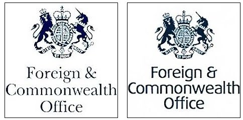
Exhibit A and Exhibit B, or, if you prefer, Before and After.
That’ll be £80,000 thankyou, Squire.
Value for money? Well ask yourself, does the new typeface (‘Frutiger’ font, as you didn’t ask) exude ‘‘Power to influence”? It does according to the glossy brochure. At least chavs and uneducated types will appreciate the removal of the Royal motto ‘Dieu et mon droit’ and the motto of the Order of the Garter ‘Honi soit qui mal y pense’ from the FCO website.
According to the FCO, its new brand represents six words: ‘Empowering, Insightful, Principled, Persuasive, Strategic and Intelligent’.
The temptation to sum it up with one ruder word, though, is strong.
Another pointless & wasteful exercise, would they be more careful if it was their own money? Somebody somewhere must have authorised this, they should be named & made to justify their actions? I shan’t hold my breath.
True. The concept of “Government” money is a malignant and seductive one. It’s taxpayers’ money. But without spending money on things like this, how would the economy manage to “grow” by it’s current stonkingly exciting 0.2% eh?
I saw this earlier – how can a new print head and set of ink cartridges cost £80k??? Christ on a bike, I thought Epson were bad enough, but this?
Chickenfeed! Just sell off all the embassies and the F&C Office, the buildings and sites are worth billions. While you are about it sell off the Commons and Lords, again the sites are worth more billions. After all these properties are fully duplicated in the EU and there is no need to maintain two governments and foreign services. Just think of the savings after sacking the army of associated parasites.
Unfortunately not even Government property prices have withstood the curse of Gordoom. The value of No10 has apparently fallen by 9% since he moved in.
And you’d have thought they could have picked a more eco-friendly font, too. Such a wasted opportunity…
They really are a joke the FCO. I thought we were supposed to be saving money.
Mind I’ve never understood why all the English mottos are in French… not Latin, not even Norman French, just ordinary French that we can all understand. (Well except the chavs and uneducated who probably don’t have much French)
I don’t really complain, as a bilingual person, who prefers French to English, I find it charming, just strange given how much the English loathe the French and vice versa.